Report Commonalities
This section details some of the visual design language that we have tried to maintain throughout the reports. Maintaining this design language will be important for keeping interface consistency between current and future reports.
Top Area of Each Report
The top area of the screen contains elements which are common to all reports.

The selection in the sample selector affects what data is shown in the reports. It was supposed to have checkboxes in the list element to cue people in to the fact that multiple selection is possible but we were unable to get that working.
Below the tab should be links to common information or hyperlinks which are common to all reports. "About This Report" give the user some conceptual background about the report, how it works, and what questions it can be used to answer. "Export this Data" identifies the transactions underlying the current view of the report and put them in to the Data Export. "Bookmark This Analysis" saves the current view of the report as a link that can be conveniently accessed. Bookmarking does not save the data state but rather the parameters that went into generating the current report view.
Report Layout Structure
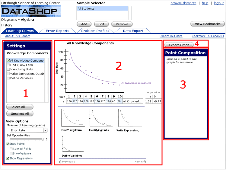
Reports can usually be thought of as consisting of 3 regions:
- Setting Area
- Main Content Area
- Detailed information Area
- Export Graph Button
The following diagram illustrates this:

The intent of this design is for the order of action when using a report to follow the natural reading order of Western languages. We recommend that new reports should follow this format as well.
Also, any controls to export graph data should be above the detail area.
Boxes
Boxes denote the grouping and separation of widgets. Boxes on a report should always have square corners.
Pop-ups
Some screens may pop-up on top of the current report. These should be boxed with rectangles with rounded corners. Also, this kind of dialog should be modal, i.e. the user should not be able to interact with user interface elements until the dialog box is closed.
Buttons vs. Hyperlinks
Hyperlinks should take you to another report or other data within a report. Buttons should be actions like saving or changing something.


