


Learning Curves Report
Sample Selector
In the learning curves report, the sample selector represents the samples for which curves should be displayed. The selected samples crossed with the selected knowledge components determines the set of curves that are currently displayed.
Example 1: If Sample A and Sample B are selected and knowledge component A and knowledge component B are selected, then the following learning curves should appear:
- Sample A, Knowledge Component A
- Sample B, Knowledge Component A
- Sample A, Knowledge Component B
- Sample B, Knowledge Component B
In the prototype we delivered, selecting multiple items sample selector is done with control-clicking. We intended for this to be done with checkboxed items in the list box. This was not implemented due to some technical difficulties that we did not investigate.
Importance: High Difficulty: Low
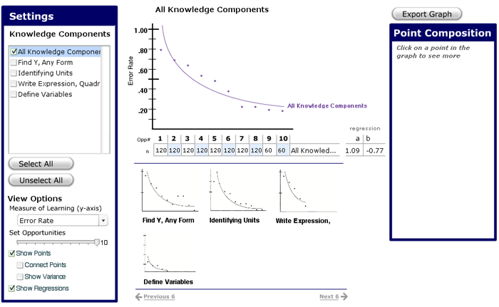
Settings Area
The settings area controls what appears in the learning curves graph. This is further divided into Knowledge Components and View Options.
Knowledge Components Settings
In the KC settings area, we display a list of knowledge components for which curves can draw. The list is a multiple selection list where clicking on a checkbox activates the curve for a knowledge component for the currently selected populations.
Users can also select all of the knowledge components or clear the selection so that they can add curves to a blank graph. Unselect All is intended to support clearing the selection when the list is long. This prevents unselection from becoming a search task.
When a user mouses over an unselected knowledge component, it appears in the highlight color which we selected in our prototype to be a shade of green. If the knowledge component is already on the screen, its curve is colored as if it had been scrubbed.
Importance: High Difficulty: Low
View Options
The View Options area controls what is seen in the graph area, what data about the knowledge component is plotted, and how the regression curve is plotted.
The controls are as follows:
- The first notion is that a cutoff at opportunity number i means that opportunities past i are not included when the regression curve is computed. When this cutoff changed, we imagined that the visual feedback would be that the learning curve past i would be darkened or faded out and a vertical dashed line would be drawn at i
Importance: Moderate Difficulty: Moderate
- The second notion is that students who don't make it to opportunity i are removed from the learning curve and removed from the computation of the regression equation. When this changes, the error rate at each point probably has to be recomputed. Also, learning curves where no students reached point i should be removed from the Knowledge Components list. Whether this would be understandable was not tested.
Importance: Moderate Difficulty: Moderate
- Ken suggested that there should be a checkbox to let the user choose whether they wanted to set a cutoff at all.
1. Measure of Learning
The measure of learning menu controls what measurement represented on the y-axis are. We found that different education researcher have different measure of learning. Changing this menu changes what kind of data is plotted on the learning curves. This control and the labeling of the control was not tested.
Importance: Moderate Difficulty: Low
2. Set Opportunities
This slider controls the cutoff of opportunities which are included in the regression of the learning curve. There are two notions of what setting a cutoff for opportunities means. These two types of cutoff should be supported by two separate controls. It is not clear whether it makes sense to support both types of the cutoff simultaneously. The slider here was intended to support the second notion of cutoff. Neither the slider nor the intended feedback were tested.
3. Show Points
This check box controls whether the points of the learning curve should be shown for all of the learning curves on display. If this box is unchecked, it follows that the Connect Points and Show Variance options should be unchecked. The Show Points option was added to reduce the visual clutter when more than one curve is checked. It is also intended to help users when they want to focus on comparing regressions of learning curves.
Importance: High Difficulty: Low
4. Connect Points:
This setting controls whether line segments are drawn between points of a learning curve. Connecting the points makes it easier to distinguish which dots come from which curve
Importance: Low Difficulty: Moderate
5. Show Variance
This setting would show the min and max of the value range around a point for the given measure of learning. For example, for the error rate measure of learning, the variance would show the maximum and minimum error rates at particular point. We came up with this idea and presented it to Vincent. He thought it might be a good idea but was not sure. The motivation for this feature is that averaging error rates from different steps can obscure the variance between error rates on certain steps if outlying values cancel each other out. Our advisors also wanted us to put this in, and one user mentioned it as a suggestion (U25).
Importance: Low Difficulty: Moderate
6. Show Regression
This controls whether the regressions curves are shown at all.
Importance: High Difficulty: Low
Learning Curves Area
The Learning Curves Area consists of the curves, the curve labeling, and the point selection method.
1. Curves
The curves are always colored. The colors we selected were dark tints that would be easy to read against a white background but also light enough as to not be confused with black. Color selection is stable. That is, when a curve first appears, it is assigned a color and it stays at that color as long as it is on the screen. Colors are also selected from an "available pool" of colors that were known to look good. When a curve is removed, the color is added back to the available pool.
Importance: High Difficulty: Low
2. Curve Labeling
Although the curves are usually about knowledge components and learning curves are about comparing knowledge components, the label on a curve depends on the selection context.
- If a single sample is selected, learning curves are labeled with the name of the knowledge component.
- If multiple samples are selected but only one curve is selected, use the name of the sample.
- If multiple samples and multiple knowledge components are selected, use a combination of the sample name and multiple knowledge components.
- When scrubbing over curves, the labeling of the new curve should be consistent with current labeling regime. For example, if multiple samples are selected but only one curve is selected, the scrubbed curve should be labeled with the knowledge component name. (However, this behavior is a bit weird because when you click on the curve, the graph will be multi-skill and multi-sample which means that the labeling changes.)
Importance:High Difficulty: Low
3. Point Selection
When the mouse is over any part of the learning curve graph, a faint indicator appears over the point which is nearest to the current mouse position within the same opportunity. The point that it appears over can come from any curve. When the user clicks, the point that is pointed to is selected and its details are presented in the Point Composition Report. We chose this design because some users didn't notice that our points were clickable despite the label in the Point Composition Report (U14, U22, U24, U26, U27, U34).
Importance:High Difficulty: Low
Attempts Table
The attempts table shows the number of attempts at a particular opportunity number. As curves are added to the display, the corresponding information is added as a new row to the table. The coefficients of the equation are displayed on the right. Ken suggested that "regression" be labeled "power regression" so that people don't assume that those are coefficients for a linear regression.
One problem that we were unable to get around to solving was how to manage the length of curve names in the table. Our recommendation is to wrap the label around to the next line (but not to the next row). The labeling of the rows follows the same rules as the labeling for the curves.
It is not clear how wide each column in the attempts table should be or how that should scale beyond 3-digits.
Importance:High Difficulty: Low
Minigraph Area
The minigraph shows miniature versions of curves for a learning curve which is composed of multiple knowledge components. The minigraphs act as buttons to select the curve particular knowledge component (replacing what's displayed).
Composite curves include the "All Knowledge Components" curve as well as composite curves defined by the user. We wanted to test an interface that allowed people to create new composite knowledge components by merging knowledge components but we did not get around to this.
Since the space below the attempts table is limited, users can "scroll" sideways by clicking "next 6" and "previous 6". The links need not be there when there aren't more than 6 mini-graphs on the screen but they were placed there for demonstration purposes.
When more than two curves appear on the graph, the minigraphs should disappear.
Importance: Moderate Difficulty: Low
Point Composition
There is not much to the Point Composition report that is not apparent in the prototype. It could be the case that more steps contribute to the opportunity number than can fit in the Point Composition report.
Importance: High Difficulty: Low
Things we would liked to have added and tested
1. Cutoff slider
Cutting out students who did not reach a particular opportunity.
Importance: Moderate Difficulty: Moderate
2. Cutoff windowshade
Cutting off opportunity numbers beyond from the right could be achieved with some kind of window shade widget.
Importance: Moderate Difficulty: Moderate
3. Live regression equation redrawing
This means that the curve redraws itself as you slide widgets which control cutoffs.
Importance: Low Difficulty: Moderate
4. Compositing curves
We wanted to provide some kind of popup which let you create composite curves. Our advisors also wanted us to put this in.
Importance:Low Difficulty: High
5. Selecting KC models
Knowledge component model could be selected using a drop-down menu above a knowledge component list. Switching models would change the list of knowledge components in the knowledge component list. Also, if you have some knowledge components selected, switch models, and then switch back, the interface should remember which knowledge components you had selected in the model. This is how one compares knowledge components between models. We felt that the task was rare enough that this would be sufficient given that the alternative would be to introduce another "variable" to the display.
Importance:Low Difficulty: Low
6. Indicator in the attempts table
It would be nice if the indicator for a selected point was also in the attempts table. This would save the user from having to search for the appropriate entry in the table.
Importance:Low Difficulty: trivial
7. Bold curves
It would be nice to use something other than color to indicate a curve that being scrubbed over. When all of the other curves are distinguished by color, adding another color isn't very useful. The only reason this is usable is because users notice that the scrubbed curve is green as they scrub the curve. Making a curve bold may be hard in Flash because it's not clear how to programmatically change a shape's attributes. It might be possible to just delete the shape and redraw a new one with a different pen stroke.
Importance:Low Difficulty: Low
8. Real regression curve computation
This involves computing a regression equation and graphing it on the screen. It would be nice if you could graph the curves using the curve tool because they would look nicer but the math involved might not make it worth it. You would basically have to translate the power curve equation into the coefficients for a beziér curve. Also, computing a power regression was hard to find and is somewhat advanced statistics. However, once you locate the mathematical algorithm, it shouldn't be too hard. What follows is code that I stole from jfreechart and translated into ActionScript which supposedly computes the coefficient but some how they disagree with coefficients I got from Excel.
/**
 * computeRegression (points)
 *	Arguments:
 *		points - an array of numbers where the index is the (i+1)th oppurtunity and
 *				 the value at i is the error rate.  For example, the value at 0 is
 *				 the error rate for the first oppurtunity.
 *
 *  [Algorithm was copied from the jFreeChart program.  Not entirely sure if this is right since
 * it differs from what Excel puts out.]
 *
 */
function computeRegression (points:Array) : Array
{
	var sumX:Number = 0;
    var sumY:Number  = 0;
    var sumXX:Number  = 0;
    var sumXY:Number  = 0;
	var n:Number = points.length;

	for (i = 0; i < n ; i++) {
		var x = Math.log (i+1);
		var y = Math.log (points[i]);
		sumX += x;
		sumY += y;
		sumXX += x * x;
		sumXY += x * y;
 }   var sxx:Number = sumXX - (sumX * sumX) / n;   var sxy:Number = sumXY - (sumX * sumY) / n;   var xbar:Number = sumX / n;   var ybar:Number = sumY / n;
var result:Array = new Array(2); result[1] = sxy / sxx; result[0] = Math.pow(Math.exp(1.0), ybar - result[1] * xbar);return result; }
Here is a picture of Jason: