


Error Reports
Error Classification Report
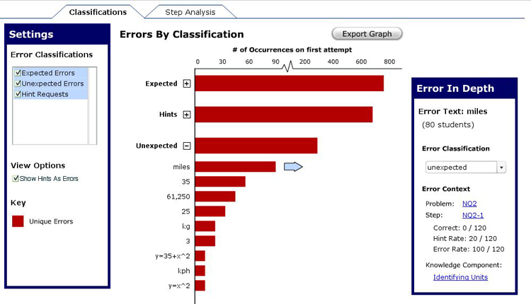
The Error Classification report was created to allow users to view errors by classification in a rank order of how often they occurred. This allows users to handle the task of looking through any unclassified errors, and to potentially create response messages in their tutors for future experiments.
Below is a description of the primary features of this report, along with their importance and an assessment of the difficulty of implementation.
1. Showing Overall Classification Rates
While most important comparisons will go on with specific errors under a particular
classification, it is worthwhile to have a bird's eye view to serve as a basis for
comparison. For example, it might be worthwhile to see how the unexpected errors
stack up to the rest of the error classifications; in an instance, the user can determine
how thorough he/she has been in accounting for potential student errors.
Importance: Moderate
Difficulty: Low
Determining the number of errors that were made under a particular classification should be
relatively easy; representing that visually in the interface should also be pretty easy depending
on how the development team chooses to implement the visualization (in Flash, this would be
as simple as setting the width of the bar).
While we didn't see explicit need for this in our research, we implemented it as a way to separate
out the various types of errors and to create a reasonable sense of hierarchy with the data.
2. Showing Multiple Error Categories At Once
Showing multiple error categories at once allows for flexible data exploration on the part of
the researcher. In this report, the task often centers around particular errors, but it seems
reasonable that a researcher would want to move quickly between different classifications.
Importance: Low
Difficulty: Low
If this feature doesn't make the final cut, the researcher will still be able to complete the task
of viewing error classifications and reclassifying errors. Nevertheless, this feature should not
be horribly difficult to implement; the hardest element should be producing a dynamic scale (see
#5 below).
3. Individual Errors Expand From Error Classifications
The initial rationale for this feature came from our peer critique group. They noted that the
previous Error Report Design didn't do well at indicating that individual
errors could be accessed by clicking on a particular class. Furthermore, going to a new page
required the user to take time regaining his/her bearings before the exploration could
continue. Putting the errors on the same scale as their classification allows for a seamless
flow of exploration as the researcher looks through the errors in this report.
Importance: Moderate
Difficulty: High
This type of dynamic feature would be pretty difficult to implement, but it is moderately important
to include. Under former designs of the error report, users would pull up that report, look at it
briefly, and decide to move on. There were no indications of what the user could do to explore
in this report. Adding more capability in one report draws the user in and encourages further
exploration.
4. Option to Show Hints As Errors
Our research showed that a number of education researchers consider hints to be errors of
omission. In this report, hints are shown as a separate classification since they aren't
really relevant in the context of another classification.
Importance: High
Difficulty: Moderate
Allowing the option to show hints as errors allows enough flexibility to the ressearchers who want
to show hints without distracting those researchers who are only interested in errors of commission.
Implementing this on the interface should not be too difficult once the rest of the report is in
place; however, it requires a way to to access hints from the database as errors, which could be
potentially difficult depending on the current structure of the database.
5. Dynamic Scale for Number of Errors
A dynamic scale was chosen to allow a maximal amount of difference between bars. That was also
the reason that a tickmark was placed in the scale. We wanted individual errors to have the highest
amount of difference between points so that the differences could be perceived.
Importance: Moderate
Difficulty: High
It seems as though having a tick mark would be a pretty difficult feature to implement. A suggestion
during the final presentation that was good was to incorporate a log scale. While that would require
more work to display the errors in the first place, a log scale would be a consistent scale
for the Error Classification scale that would still allow for visual differentiation between
the different errors.
6. Details on a Particular Error
Once a user has found an error that needs to be examined, he/she needs to be able to click on it
in order to drill in further. It should give the user enough information to understand where
the error was made, as well as the capability to navigate to another report to gain any necessary
context.
Importance: High
Difficulty: Moderate
Setting this up on the interface side was not very difficult, but accessing information that is
"relevant to the error" could be potentially difficult. If there is some time and effort put
in to the conceptualization of the various tutor elements and how they relate to one another,
then it should be relatively easy to implement this feature.
7. Export Graph
Aside from accessing the data behind a report, it might be desirable to actually take
the graph itself out of the Data Shop for use in a presentation or paper. As such, we
have provided a way to export an image of the graph or the data behind the graph.
Importance: Moderate
Difficulty: Moderate
If you have the points that generate a particular curve, it should be relatively easy to export
the data to a comma delimited file or an Excel spreadsheet. Slightly more difficult is exporting
the image itself as a jpeg or a gif. Yet this capability was seen as beneficial in our
preliminary research.
Errors-By-Step Analysis
The Step Analysis was created to view all of the errors on a particular step. Note that, unlike the Error Classification report, this report does not consider errors individually; but rather, groups them by step. As such, it is necessary to be able to query the database to get all the steps, and each step returned should have an indication of the errors associated with them.
This report also needs to be able to report hint rates on a particular problem, as well as the correct response rate. Everything shown deals with first responses.
Below is a description of the primary features of this report, along with their importance and an assessment of the difficulty of implementation.
1. Option to View By Problem or Knowledge Component
Depending on the researcher's interest, it could be relevant to view the data by
Problem or by Knowledge Component. This was seen frequently in our interaction with education
researchers... either "I want to figure out what the hardest problem was" or "I want to figure out
which knowledge component was hardest to learn."
Importance: High
Difficulty: Moderate
The difficulty was assessed as moderate because, in some ways, this new grouping is equivalent to
creating a new report. This isn't as simple as resorting the data; instead, it needs to be
reclustered by knowledge component. Additionally, there's a different consideration for clustering
by Knowledge Components since a step can belong to multiple Knowledge Components but only one Problem.
2. Capability to View Average Error Rate (per Problem, Knowledge Component)
This bird's eye view will be very important in giving researchers a quick glance into answering
"Which ________ is the hardest?"
Importance: Moderate
Difficulty: Low
Averaging the rates of the steps under a problem / knowledge component is a relatively
straight-forward operation; from there, it seems that displaying a problem or a knowledge
component is the same difficulty as creating the rest of the report.
3. Showing Multiple Problems / Knowledge Components At Once
Showing multiple problems / knowledge components at once allows for flexible data exploration
on the part of the researcher. In this report, the task often centers around particular errors,
but it seems reasonable that a researcher would want to move quickly between different
classifications.
Importance: Low
Difficulty: Low
If this feature doesn't make the final cut, the researcher will still be able to complete the task
of viewing errors by step. Nevertheless, this feature should not
be horribly difficult to implement.
4. Individual Errors Expand From Problems / Knowledge Components
The initial rationale for this feature came from our peer critique group. They noted that the
previous Error Report Design didn't do well at indicating that individual
errors could be accessed by clicking on a particular error group. Furthermore, going to a new page
required the user to take time regaining his/her bearings before the exploration could
continue. Putting the errors on the same scale as their classification allows for a seamless
flow of exploration as the researcher looks through the errors in this report.
Importance: Moderate
Difficulty: High
This type of dynamic feature would be pretty difficult to implement, but it is moderately important
to include. Under former designs of the error report, users would pull up that report, look at it
briefly, and decide to move on. There were no indications of what the user could do to explore
in this report. Adding more capability in one report draws the user in and encourages further
exploration.
5. Option to Show Hint Responses & Correct Responses
When conducting analysis by step, some researchers only want to see errors of commission, while
others want the ability to create a stacked bar chart and see everyone's performance on a particular
step. This report is overloaded to provide that capability. If the user chooses to, he/she can
see only the errors (including hints if they are taken as errors of omission), or the user can
also show correct responses and see everyone's performance on a particular problem.
Importance: High
Difficulty: Moderate
At the point that the report can access error rates on the first attempt of a particular step,
it should be relatively easy to get the hint rate and correct rate as well. Showing these elements
dynamically might be somewhat difficult, depending on the implementation approach taken by the
development team.
6. Details on a Particular Step
Once a user has found a step that needs to be examined, he/she needs to be able to click on it
in order to drill in further. It should give the user enough information to understand where
the error was made, as well as the capability to navigate to another report to gain any necessary
context.
Importance: High
Difficulty: Moderate
Setting this up on the interface side was not very difficult, but accessing information that is
"relevant to the error" could be potentially difficult. If there is some time and effort put
in to the conceptualization of the various tutor elements and how they relate to one another,
then it should be relatively easy to implement this feature.
7. Export Graph
Aside from accessing the data behind a report, it might be desirable to actually take
the graph itself out of the Data Shop for use in a presentation or paper. As such, we
have provided a way to export an image of the graph or the data behind the graph.
Importance: Moderate
Difficulty: Moderate
If you have the points that generate a particular curve, it should be relatively easy to export
the data to a comma delimited file or an Excel spreadsheet. Slightly more difficult is exporting
the image itself as a jpeg or a gif. Yet this capability was seen as beneficial in our
preliminary research.