


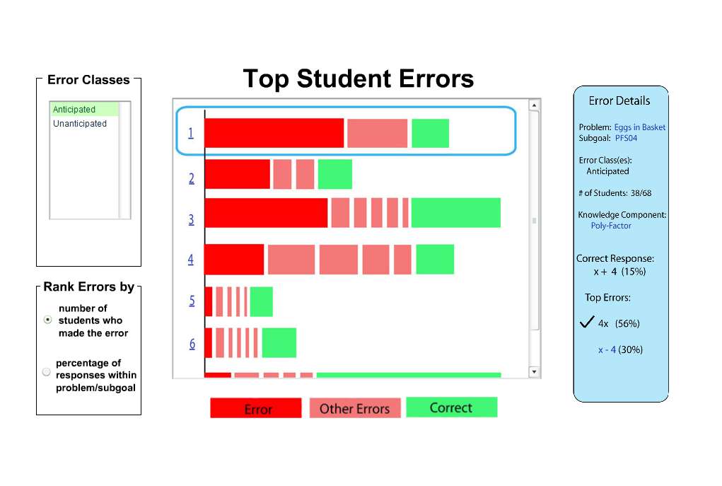
Error Report
Vertical Error Report
This error report appears at first glance to be similar to the end product. However, there was low visibility (what do the numbers 1, 2, 3, etc. do?) and it was difficult for the team to explain it. The design had so many problems in this stage that we chose to re-design before subjecting it to testing.
Tabbed Error Report
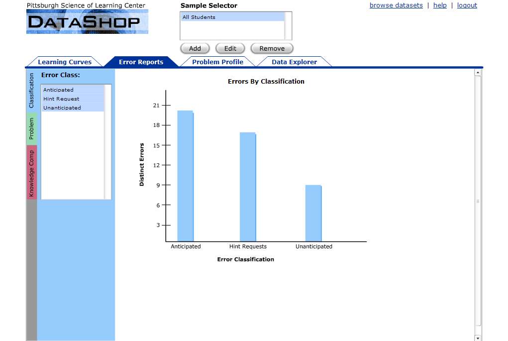
This error report was user tested. Many users did not see the side tabs and as a result did not think that the error report module held anything useful for them. (U27, U29, U32, U33) Especially since the "default" was Classification and "expected", "unexpected" and "hints" were the only classifications. The most critical reason we abandoned this design was that it did not expand enough to provide the "step analysis" information we designed into the final version. We also changed back to a vertical orientation because users don't like scrolling. And they really don't like horizontal scrolling. Scrolling and Scrollbars, Useit.com