Full Design
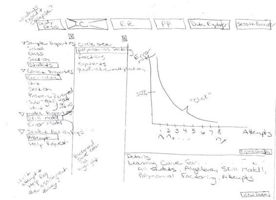
Learning Curve Sketch

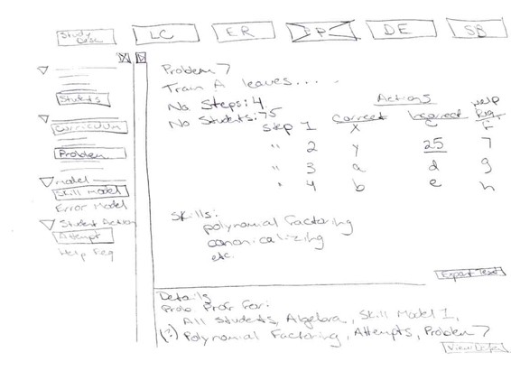
Problem Profile Sketch

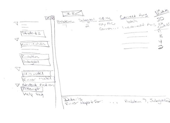
Error Report Sketch

Paper Prototype (U9, U10)
This early categorical navigation design helped us better understand relationships out of the database fields. Initially, it seemed promising. The selection mechanism had the potential to be consistent across reports and even carry through to data export - a big advantage. It unfortunately had some big disadvantages: The hierarchical relationship of the elements (school, class, unit, section...) was not represented. This design made the users feel out of control. The user could un-check something deep within a category, check the parent category on a different task, and then later find that what they had un-checked by hand had become re-checked. Finally, there was too much of a memory load to keep track of what was (and should logically be) selected or unselected. For example, the user could click on "All Schools" OR "All Students" and have the same effect (all students would be selected).


